PostUp
Five days. One case study.
Five days. One case study.

Role: UX /UI Designer
Role: UX /UI Designer
Role: UX /UI Designer
Timeline: 5-Day Modified GV Sprint
Timeline: 5-Day Modified GV Sprint
Timeline: 5-Day Modified GV Sprint
Tools: Figma
Tools: Figma
Tools: Figma
Project Overview
PostUp is a startup app where freelancers and remote workers share tips and advice after receiving feedback from users about the difficulty of finding good public places to work while on the go, the team initiated a 5-day Design Sprint. The goal was to explore a solution that helps users easily discover reliable, work-friendly locations nearby.
Callege
PostUp is a startup app where freelancers and remote workers can share tips and advice. After gathering feedback, they discovered a consistent pain point:
“It’s hard to find a good public place to work from especially when you’re traveling or trying to work in new neighborhoods.”
PostUp is a startup app where freelancers and remote workers can share tips and advice. After gathering feedback, they discovered a consistent pain point:
“It’s hard to find a good public place to work from especially when you’re traveling or trying to work in new neighborhoods.”
I joined this design sprint to help PostUp explore how we might solve that problem. There were two key constraints I had to keep in mind:
PostUp doesn’t own or manage any physical workspaces.
The platform needs to be monetized via a monthly subscription, which gives users access to premium content and features.
The goal was to design a solution that made it easy and fast for users to find a work-friendly spot without relying on trial and error.
Day 1 – Map
Mapped user journeys
Day 2 – Sketch
Ideation & sketching
Day 3 – Storyboarding
Selected best solution
Day 4 – Prototype
Built interactive prototype
Day 5 – Test
User testing & feedback
Day 1: Map
Day 1: Map
I kicked things off by interviewing remote workers and freelancers to understand how they currently find places to work. A few things stood out:
Most people rely on Google Maps, Yelp, or recommendations from friends.
Key factors in decision-making included amenities, photos, and busyness during peak hours.
Some wished they could see a live crowd estimate or know whether tables were available before going.
It’s a time-consuming process that often involves bouncing between apps and making guesses.
Users want:
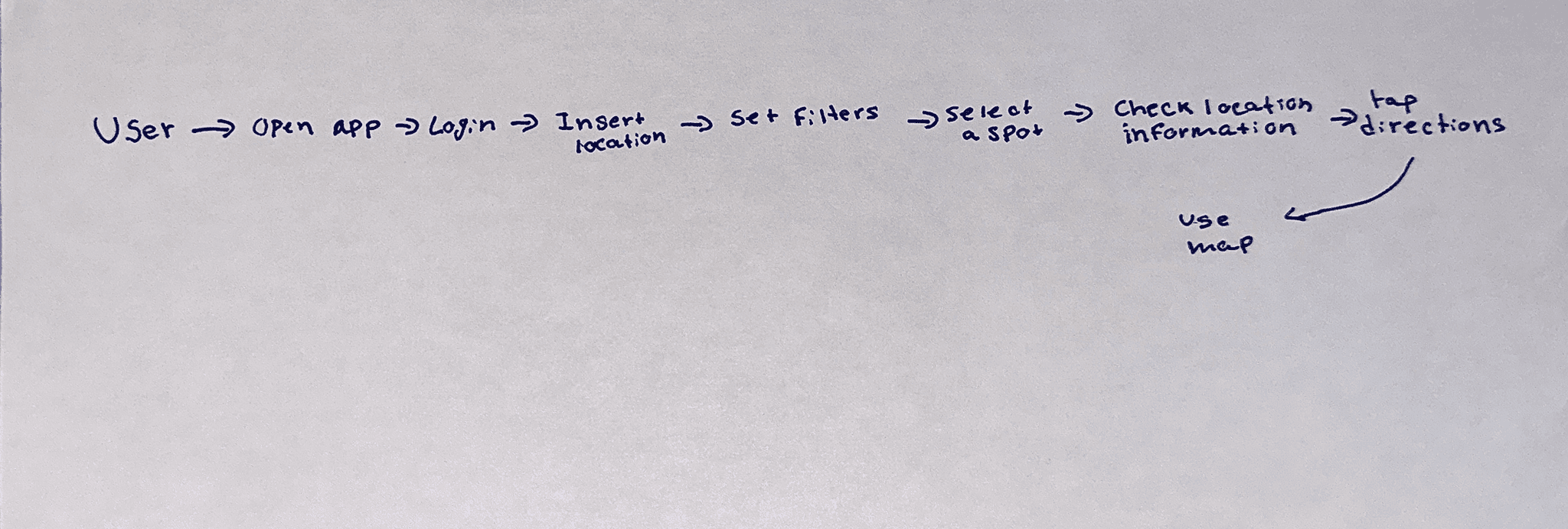
With these insights, I mapped out the ideal journeyfrom opening the app to arriving at a new favorite workspace, fully informed and confident.
Users want:
With these insights, I mapped out the ideal journeyfrom opening the app to arriving at a new favorite workspace, fully informed and confident.
Day 2: Sketch
Day 2: Sketch
To explore potential solutions, I did a round of Lightning Demos, pulling inspiration from apps like:
Yelp (amenities, location, and ratings)
OpenTable (quick filters and review containers)
Google Maps (crowd tracking, time-based busyness trends)
To explore potential solutions, I did a round of Lightning Demos, pulling inspiration from apps like:
Yelp (amenities, location, and ratings)
OpenTable (quick filters and review containers)
Google Maps (crowd tracking, time-based busyness trends)

Then, I sketched out eight ideas during a Crazy 8s exercise, focusing on usability and clarity. I ended up selecting a direction that prioritized clean filters, a simplified map interface, and a detailed spot page that felt informative but not overwhelming.
Then, I sketched out eight ideas during a Crazy 8s exercise, focusing on usability and clarity. I ended up selecting a direction that prioritized clean filters, a simplified map interface, and a detailed spot page that felt informative but not overwhelming.


Day 3 – Storyboarding
Day 3 – Storyboarding
Day 3 – Storyboarding
When I built the storyboard, my main goal was to balance simplicity with useful information. I wanted users to move from “Where can I work?” to “Here’s the spot” in just a few taps.
Key features I included:
Multiple sign-in options (email, Google, Apple)
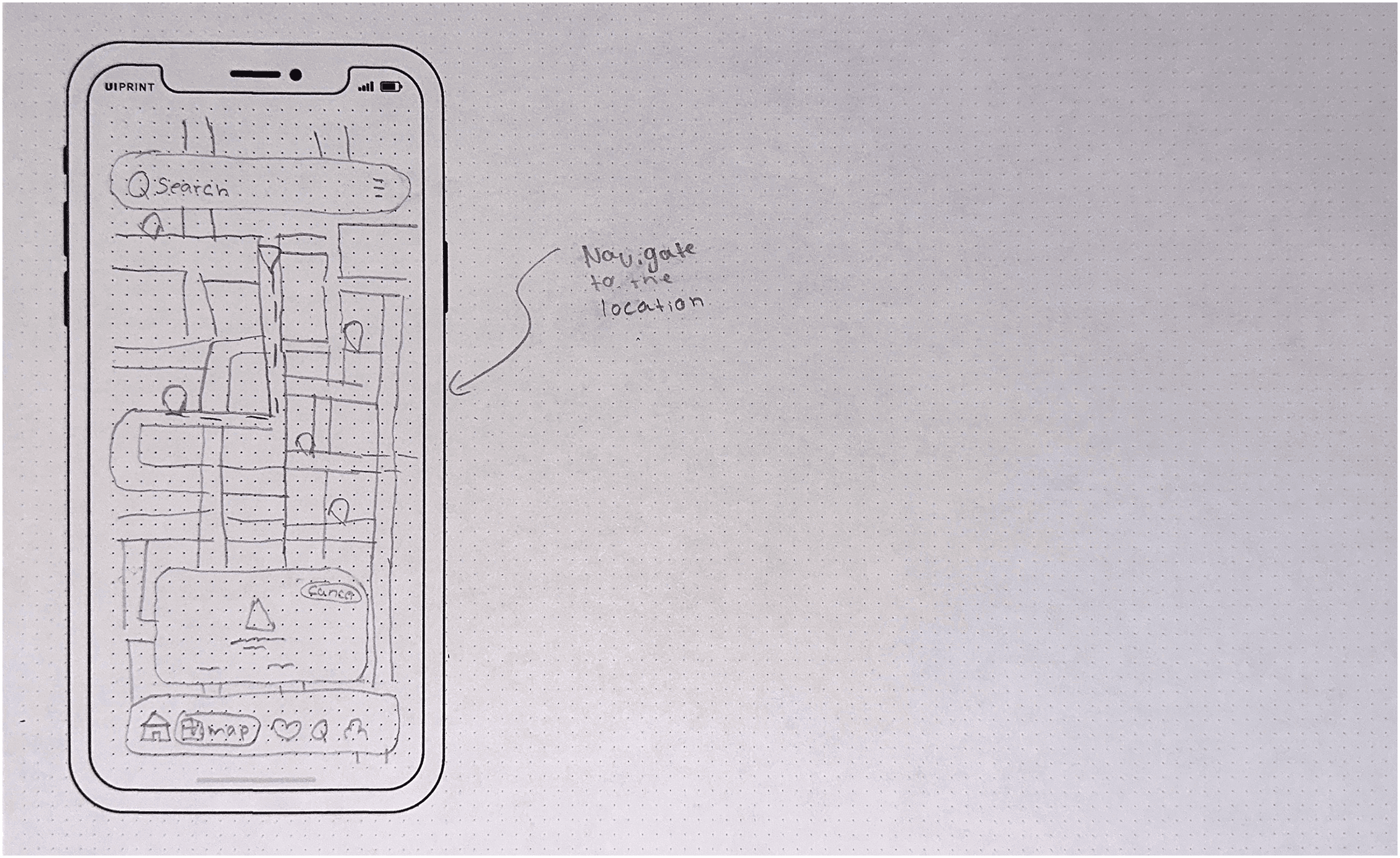
A filterable map showing locations that matched user preferences
A detailed info screen with distance, crowd level, amenities, and hours
The ability to favorite spots for quick access later
The design was intentionally minimal, with clear visual hierarchy, calm colors, and space to breathe.
When I built the storyboard, my main goal was to balance simplicity with useful information. I wanted users to move from “Where can I work?” to “Here’s the spot” in just a few taps.
Key features I included:
Multiple sign-in options (email, Google, Apple)
A filterable map showing locations that matched user preferences
A detailed info screen with distance, crowd level, amenities, and hours
The ability to favorite spots for quick access later
The design was intentionally minimal, with clear visual hierarchy, calm colors, and space to breathe.


Day 4 – Prototype
Day 4 – Prototype
Day 4 – Prototype
I brought the storyboard to life with a high-fidelity prototype in Figma. I made sure every screen helped users make fast, confident decisions—no fluff, just what matters.
I brought the storyboard to life with a high-fidelity prototype in Figma. I made sure every screen helped users make fast, confident decisions—no fluff, just what matters.
I brought the storyboard to life with a high-fidelity prototype in Figma. I made sure every screen helped users make fast, confident decisions—no fluff, just what matters.
Some features I wanted to test:
Could users sign in easily?
Were the filters intuitive and fun to use?
Did the info page give them enough to choose a workspace without switching apps?
Some features I wanted to test:
Could users sign in easily?
Were the filters intuitive and fun to use?
Did the info page give them enough to choose a workspace without switching apps?
Some features I wanted to test:
Could users sign in easily?
Were the filters intuitive and fun to use?
Did the info page give them enough to choose a workspace without switching apps?
The prototype also included a subscribe wall that limited some content unless users signed up, which I knew might raise questions—something I planned to test.
The prototype also included a subscribe wall that limited some content unless users signed up, which I knew might raise questions—something I planned to test.
The prototype also included a subscribe wall that limited some content unless users signed up, which I knew might raise questions—something I planned to test.

Day 5 – Test
Day 5 – Test
Day 5 – Test
I ran moderated usability tests with five participants. I asked them to:
Sign in
Filter locations
Choose a workspace they’d actually use
I ran moderated usability tests with five participants. I asked them to:
Sign in
Filter locations
Choose a workspace they’d actually use
I ran moderated usability tests with five participants. I asked them to:
Sign in
Filter locations
Choose a workspace they’d actually use
What I Learned:
Sign-in worked well
Everyone completed sign-in smoothly, and people appreciated having options like Google.
Filters were a hit
Marcus said they were “fun to play with.” Elena liked the advanced filter controls. Tyrese was a bit confused by the filter icon at first, but figured it out quickly.
Map and info needed more clarity
Some users—like Elena and Tyrese—wanted to see reviews, menus, or better visuals. The map felt too limited on its own.
Confusion about the Subscribe button
Nia and Jamal weren’t sure what the “Subscribe” button did or why they couldn’t see more spots. I realized I needed to explain this better, either through copy or onboarding.
Standout features
The ability to favorite spots and use current location felt fast and valuable. Marcus even said he’d use this before exploring new neighborhoods.
These quick tests revealed how small UX gaps can impact flow:
Clarity is king: Labels, icons, and copy all need to be ultra-clear—especially around paywalls or locked content.
Personalization builds trust: Users liked being able to customize filters or save their favorite spots.
Context makes decisions easier: Reviews, live busyness info, and clear photos help users commit faster.
Reflection
Reflection
Reflection
Running this sprint helped me move fast without skipping quality. I learned that even when the UI feels smooth to me, users always surface blind spots—like unclear buttons, missing labels, or gaps in information.
If I were to rerun this sprint, I’d:
Add a simple onboarding flow or tutorial for new users
Make the subscribe tier clearer (with benefits listed)
Include user reviews or photo galleries for each location
I believe good UX design removes doubt when users feel informed, they feel confident.
This sprint wasn’t just about designing a tool to find a workspace. It was about helping remote workers find focus and ease, no matter where they are.
Running this sprint helped me move fast without skipping quality. I learned that even when the UI feels smooth to me, users always surface blind spots—like unclear buttons, missing labels, or gaps in information.
If I were to rerun this sprint, I’d:
Add a simple onboarding flow or tutorial for new users
Make the subscribe tier clearer (with benefits listed)
Include user reviews or photo galleries for each location
I believe good UX design removes doubt when users feel informed, they feel confident.