Streamlining the Service & Repair Experience for Flir
Streamlining the Service & Repair Experience for Flir
Project Overview
Flir is a platform supporting the deployment and management of various products, including FCP and camera courses. Our team of four designers was tasked with auditing the QA website and aligning it with the existing design system. My focus was the Service and Repair flow, guiding users from product registration to submitting a repair request.
The Challenge
Improve the Service & Repair flow to eliminate friction, enhance clarity, and restore user trust by resolving issues related to navigation, iconography, and system feedback.
Research & Discovery
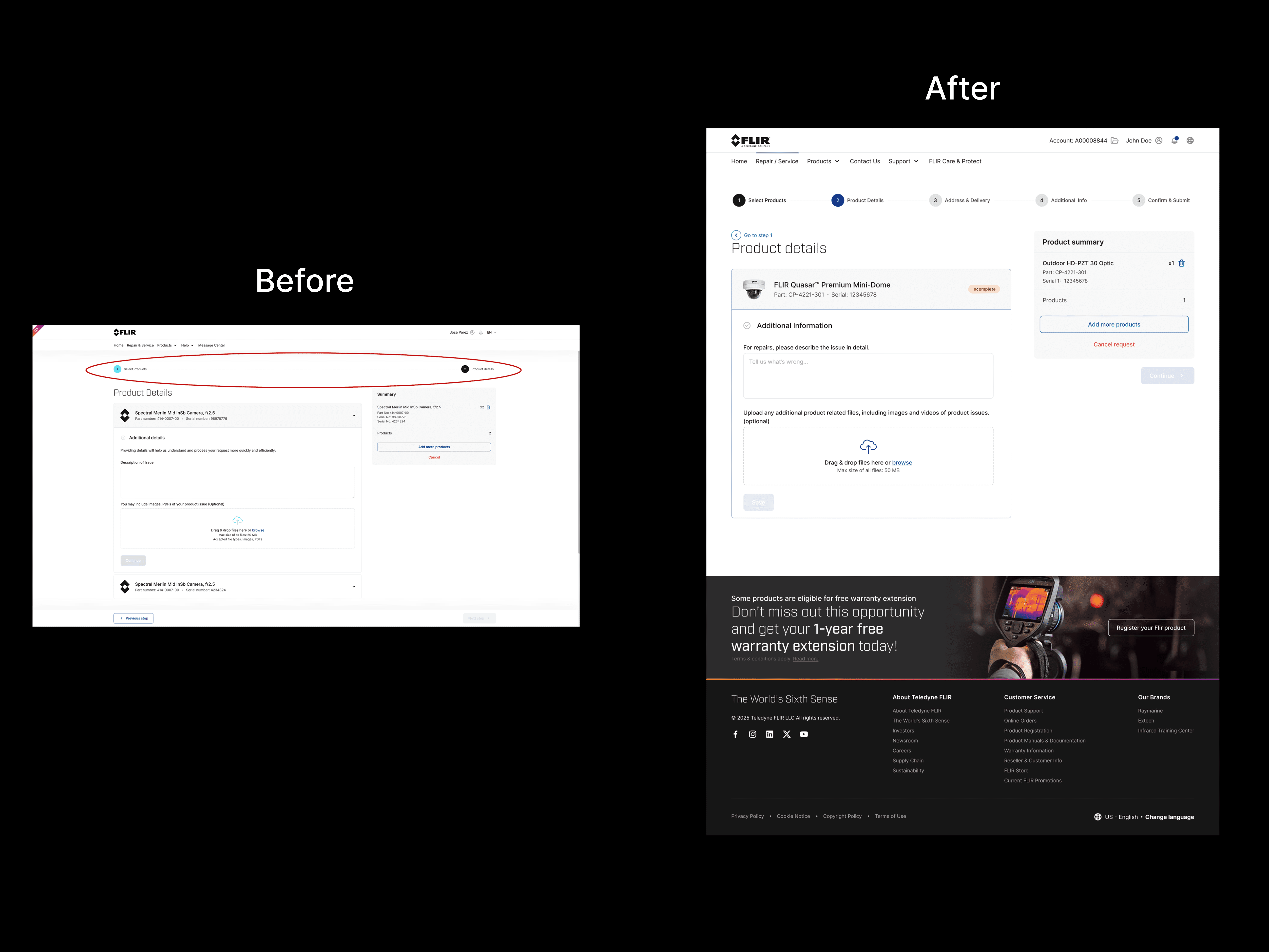
After reviewing the QA website, Identified key usability issues:
Overuse of CTA colors reduced visual hierarchy
Inconsistent icons caused confusion
Progress indicators were poorly aligned
Interaction states lacked clarity and consitency
Heuristic Evaluation Insight
A heuristic review was conducted across core UX principles:
Visibility of System Status: Clear page titles and status indicators (e.g., “Register” ➔ “Select a Product”), though inconsistently applied across steps.
Match Between System and Real World: Straightforward wording and iconography kept interactions intuitive, except where certain icons resembled a “download” action.
User Control and Freedom: Users could move backward or cancel, providing a strong sense of control.
Consistency and Standards: Buttons, links, and components adhered to a common style, but were inconsistently implemented across screens.
Error Prevention: Clear labels and cues effectively minimized user error.
Recognition Rather Than Recall: Clear labels and consistent design allowed users to understand interactions at a glance.
Flexibility and Efficiency of Use: The site offered basic backward navigation but lacked quick access to higher-level sections like the Message Center.
Authentic and Minimalist Design: The clean, focused layout minimized cognitive load and supported a streamlined experience.
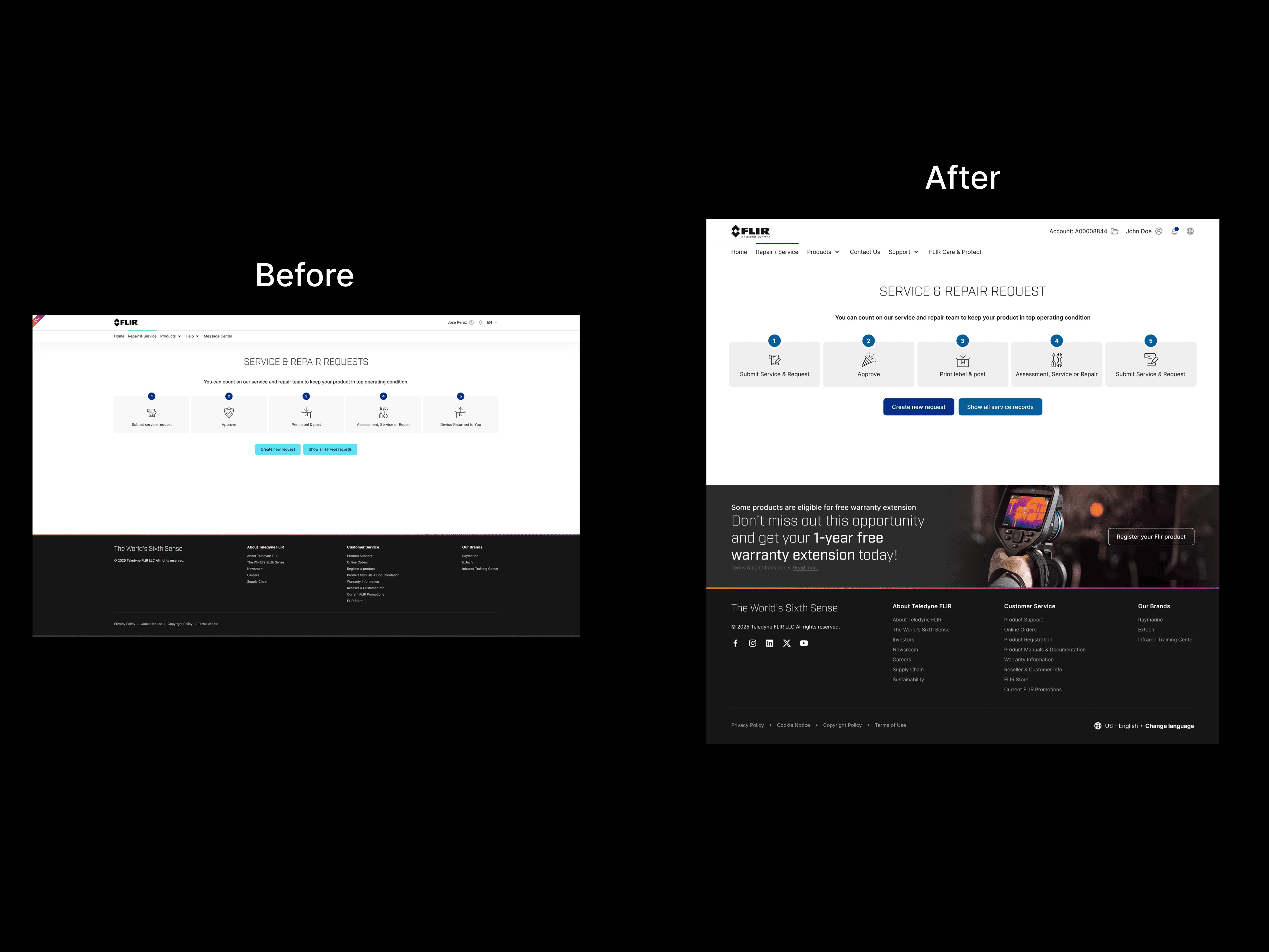
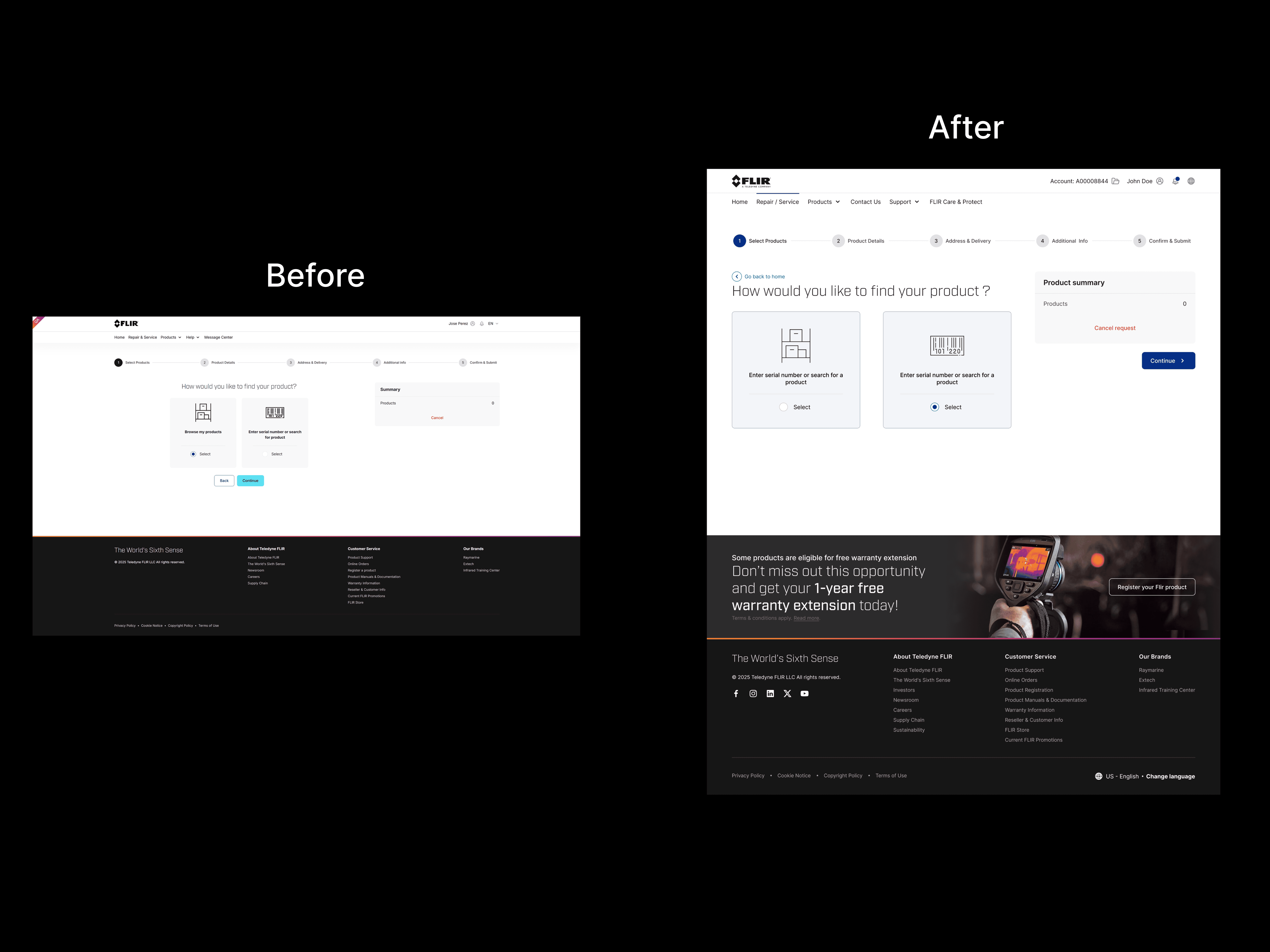
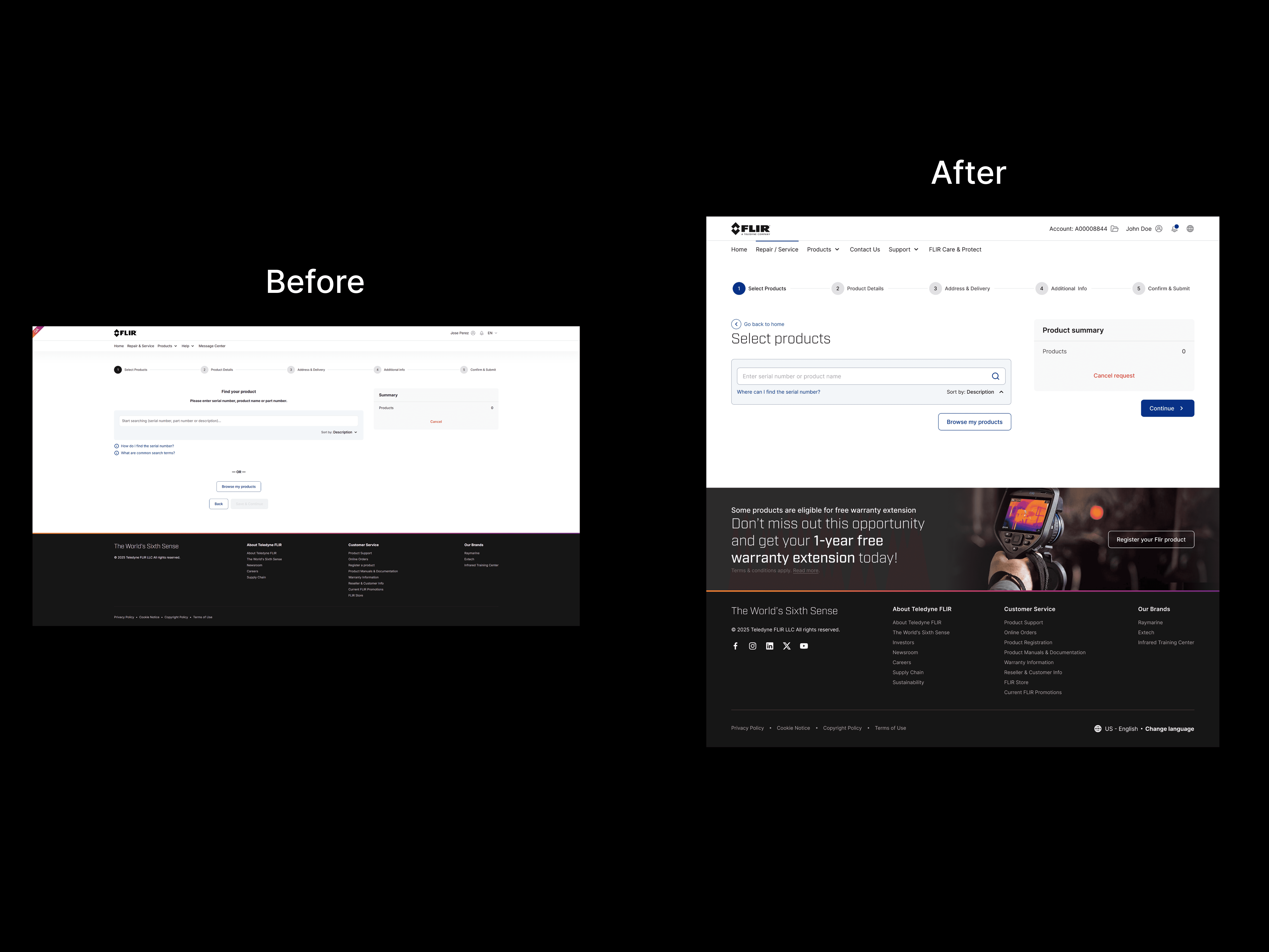
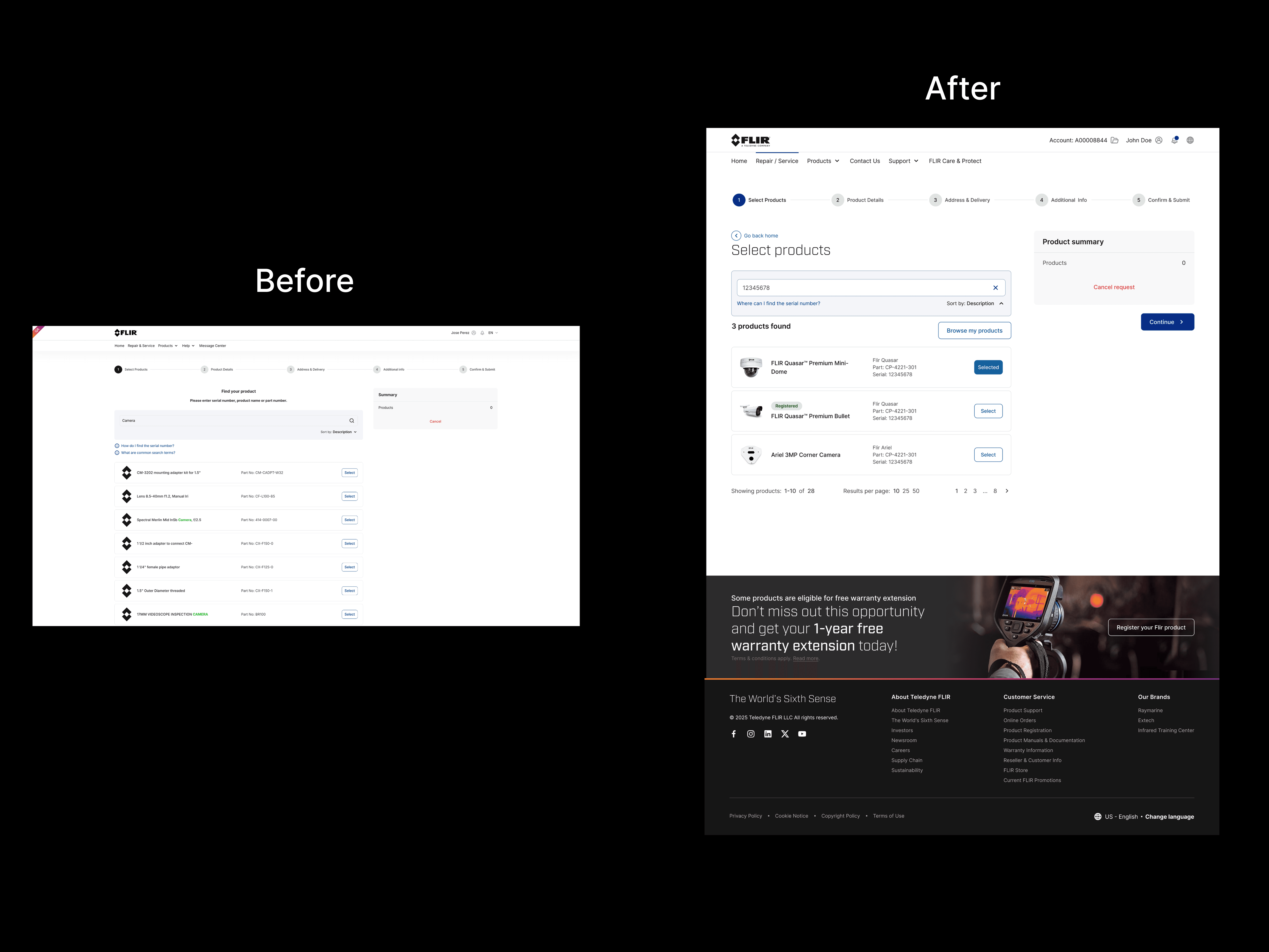
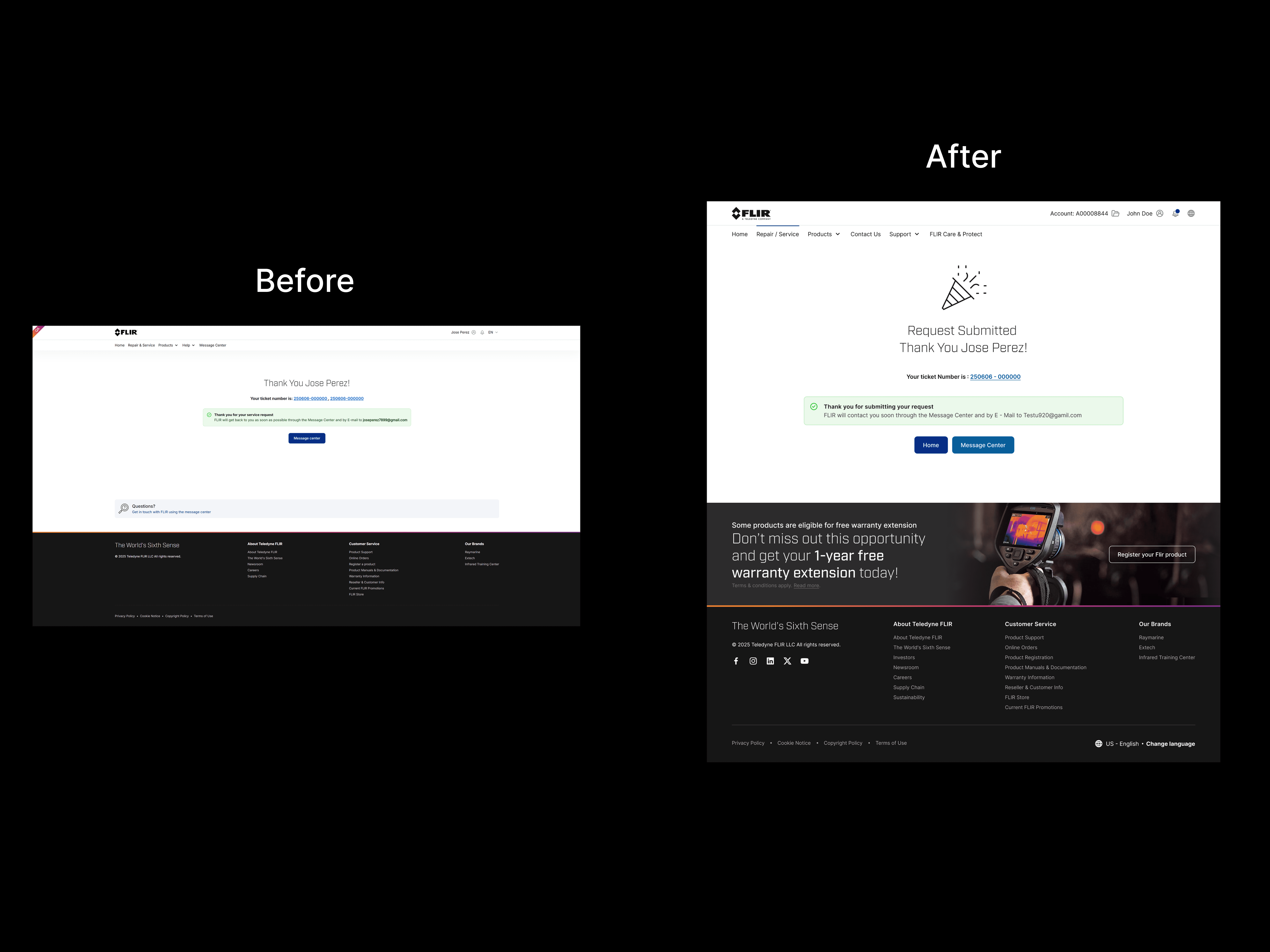
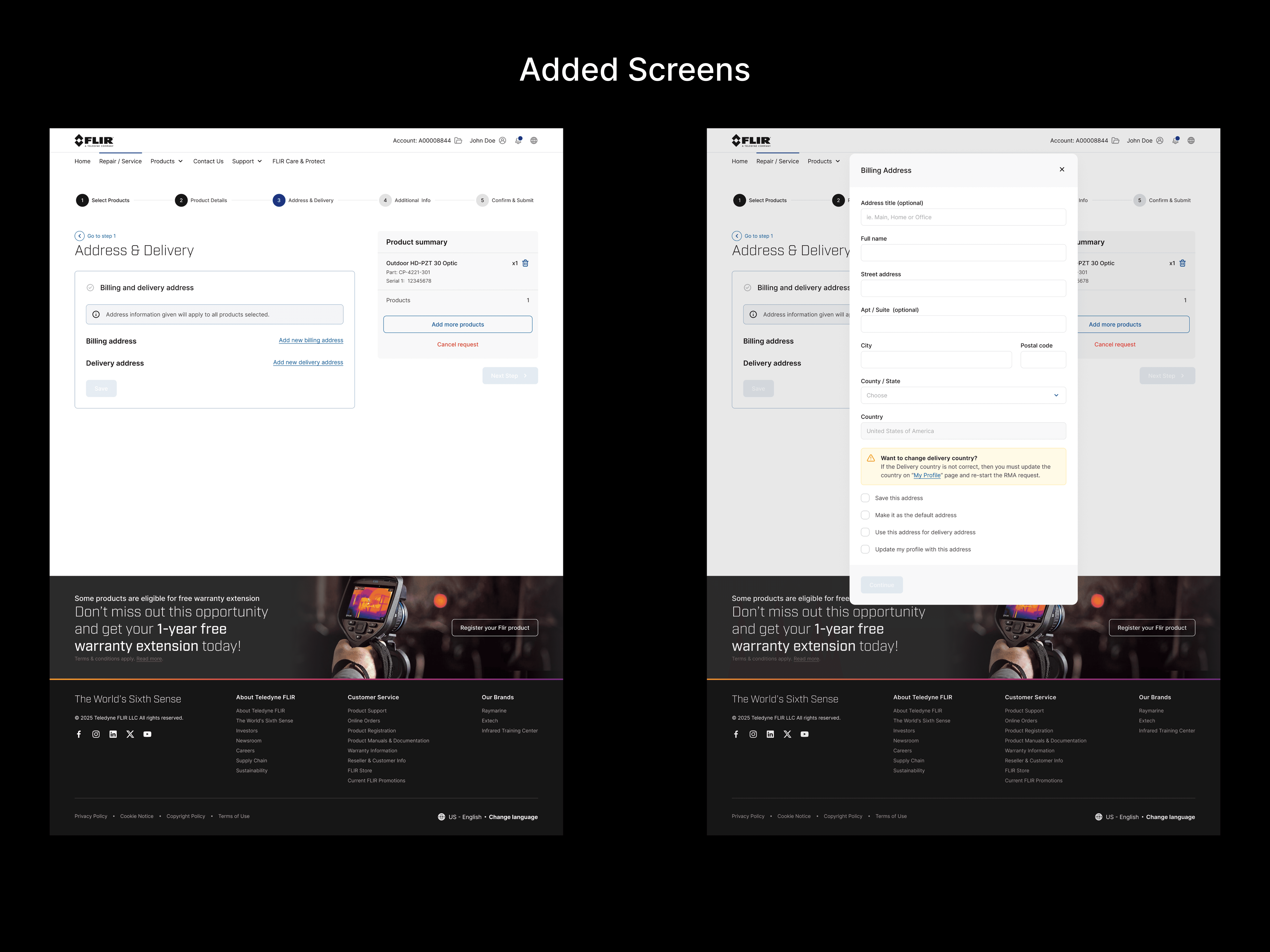
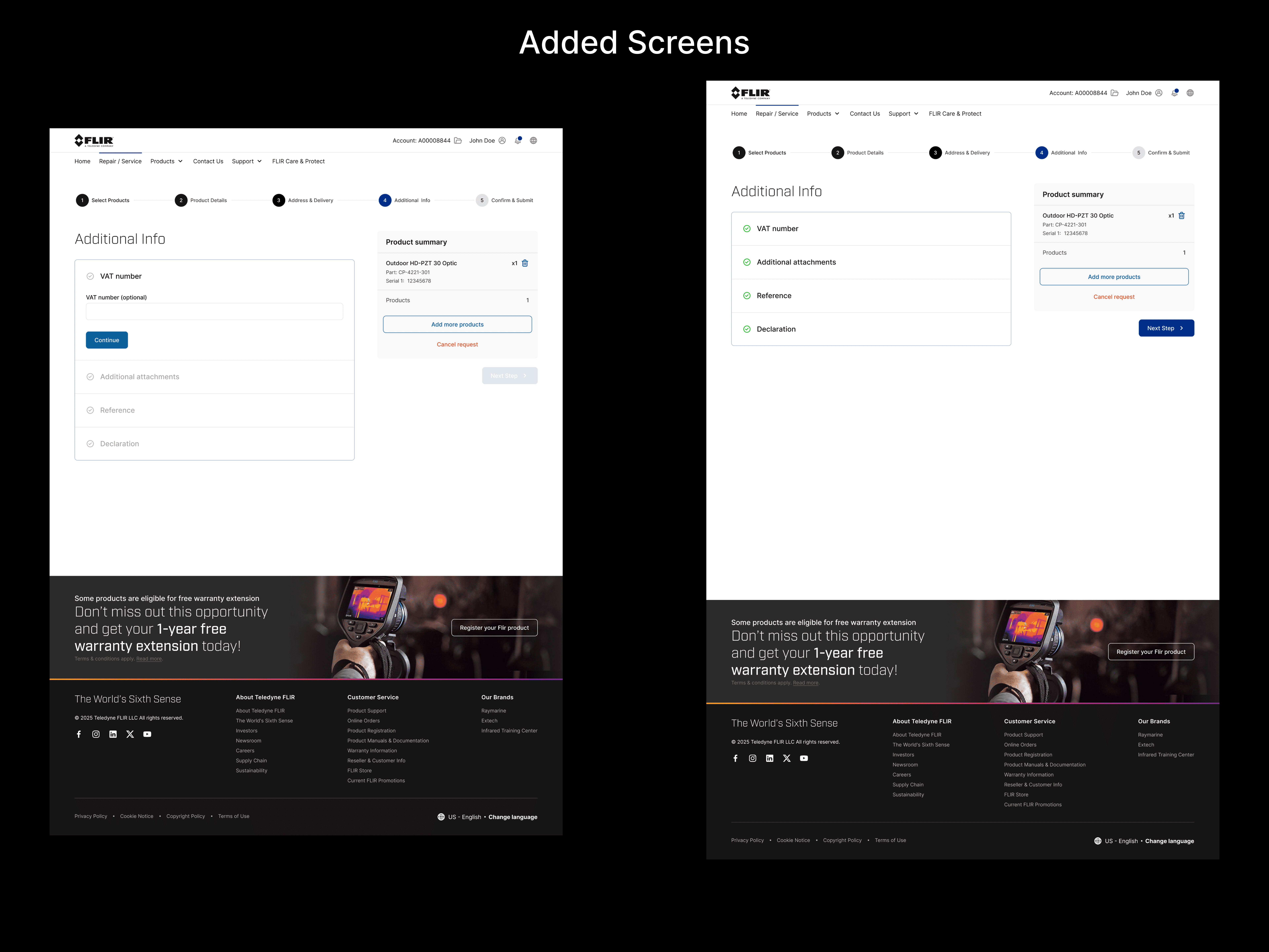
The Solution
Simplified the number of button types
Replaced icons with more universal, purpose-driven symbols
Unified progress indicators for consistency across all screens
Created a review screen before final submission for user confirmation
Enhanced form clarity and visual balance on success screens
Takeaways
Redesigning the Service and Repair flow for Flir provided valuable insights into the importance of visual and interaction consistency within complex platforms. Here’s what I learned:
Consistency drives confidence: Even minor inconsistencies in icons, buttons, or CTAs can undermine user trust. Aligning all UI elements with the design system improved clarity and reduced friction.
Progress visibility is key: A well-structured progress indicator can significantly improve a user’s sense of orientation, especially in multi-step flows.
Heuristic reviews are powerful: Using core UX principles to guide audits helped uncover both surface-level and structural usability issues that might’ve been overlooked otherwise.
Collaboration matters: Working in a team of designers required clear communication and alignment to ensure a cohesive user experience across different parts of the platform.
Small details make a big impact: Simple adjustments—like clearer labels or more thoughtful icon choices—added up to a smoother, more intuitive user journey.
This project reinforced the importance of thoughtful, system-aligned design and highlighted how focused UX improvements can transform the usability of a product.